Scaling a
Global Design System
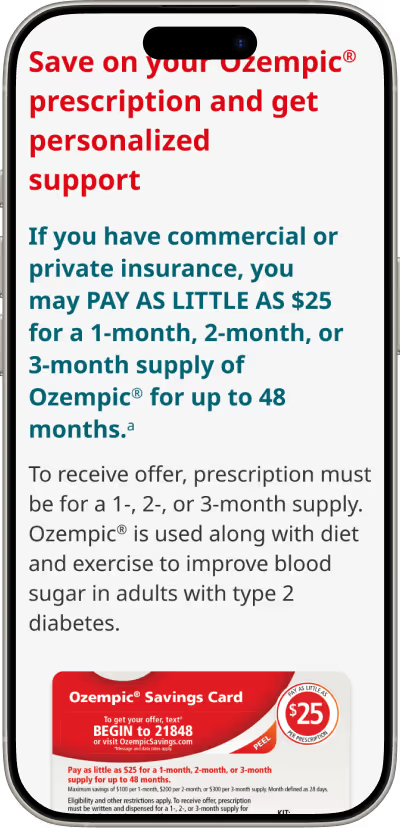
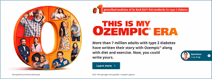
Ozempic came to us with a flagship U.S. website that was inaccessible, confusing, and not scaled for global use.
I led the BGB team's UX design and integration efforts, working directly with Novo Nordisk stakeholders to understand their goals and translate their vision to fresh wireframes and thoughtful layouts for a global design system.
Beyond design, I advocated for accessibility, defined reusable components to reduce design debt, and Streamlined cross-team handoff through systemized templates.
Lead Designer
Directed 5 teamates
2024-2025
Problem
Unclear information hierarchy left users feeling overwhelmed
Disjointed layouts disrupted natural scanning patterns
Inconsistent color application weakened brand cohesion
Accessibility was limited by poor contrast, missing alt text, and heavy imagery
Goal
Redesign Ozempic’s U.S. site to align with the global design system
Streamline hierarchy for clarity, standardize layouts for intutive scanning, unify color to strengthen brand trust, and elevate accessibility to meet WCAG standards
Insight
Users seek clarity, consistency, and confidence when navigating healthcare content.
By aligning the site with natural scanning behaviors, clarifying calls-to-action, and enforcing a unified visual and interaction language, we reduced cognitive load and strengthened brand trust, ultimately making it easier for users to find and act on what mattered most.
Key Decisions
Supported user journey
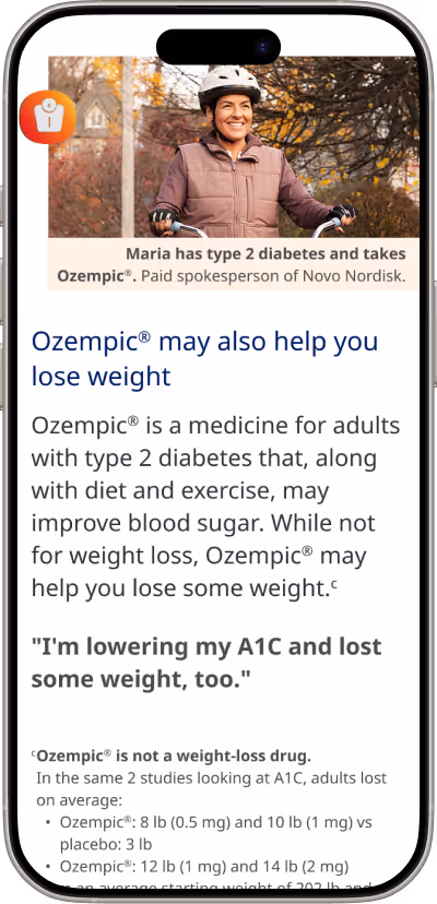
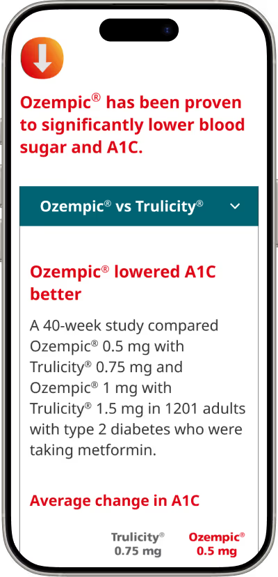
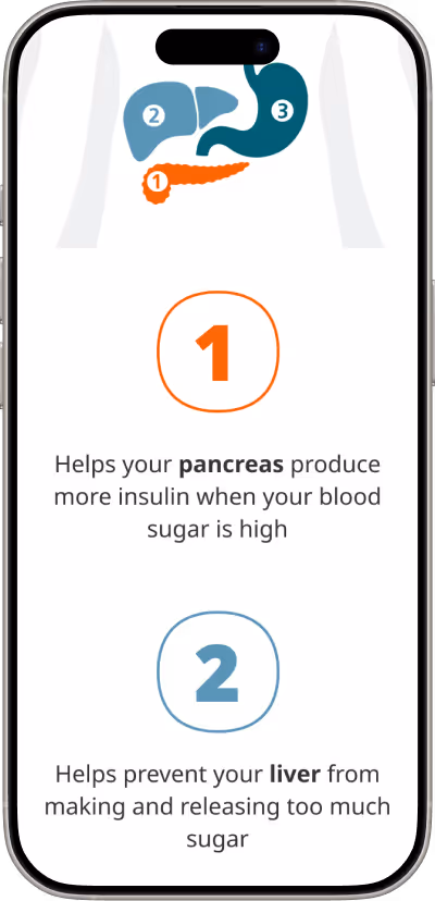
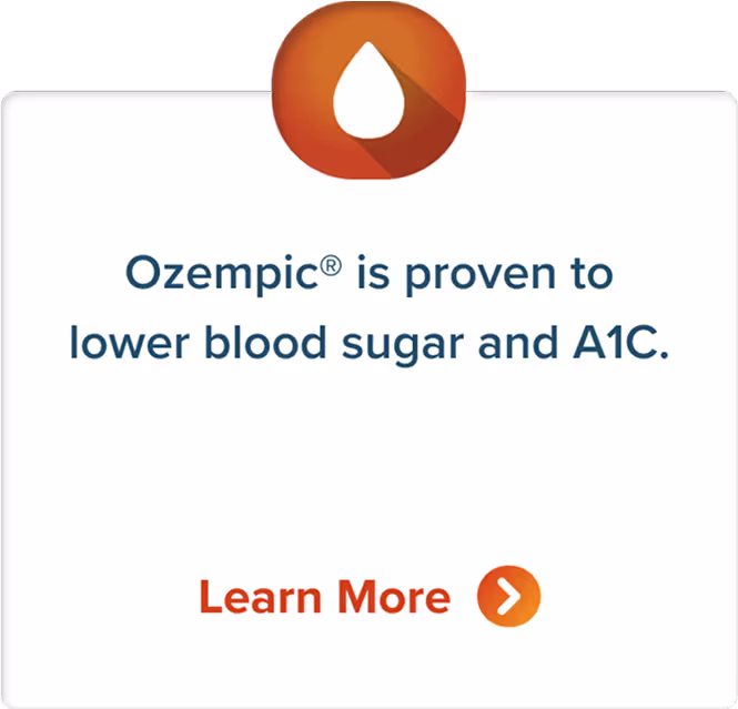
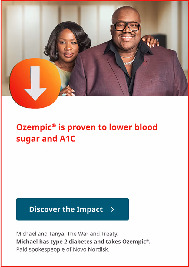
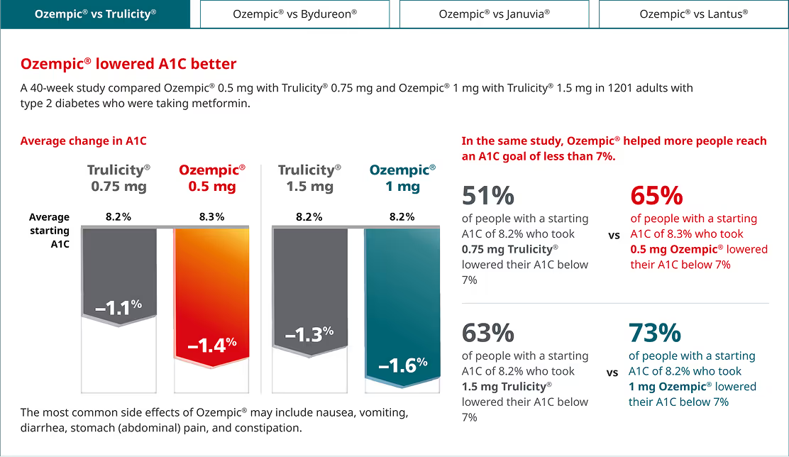
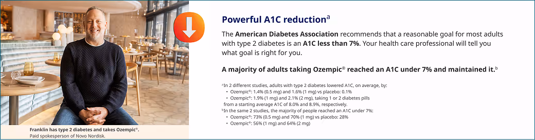
Introduced side-by-side layouts aligned with the global design system. This surfaced comparisons at a glance, creating a more cohesive user journey.
Systemized for scale
Collaborated with the Novo Nordisk dev team to create notations that mapped design system components to each layout type, accelerating implementation and reducing ambiguity.
Clarified content hierarchy
Standardized typographic hierarchy to reduce redundancy and improve scanability. This reinforced consistent content structure and lowered cognitive load for users navigating complex health information.
Strengthened brand coherence
A single, consistent color system and icon suite built familiarity across the site and reduced design debt for future updates.


Standardized layouts
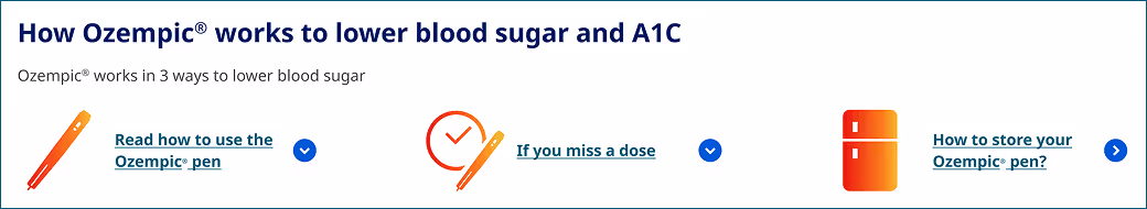
Refined section layouts to establish clear visual patterns. This gave users consistent wayfinding cues and enabled faster scanning of critical information.
Outcomes
The redesign improved accessibility, strengthened user trust, and established a scalable design foundation.
By translating brand rules into reusable templates and components, I enabled future teams to work faster, reduce inconsistencies, and apply the system across multiple digital properties.
Product-minded design practices of consistency, reusability, and accessibility can be applied even in highly regulated industries. This approach laid the groundwork for more user-centered, adaptable systems beyond pharma.